Week 25 - Realism and Art Nouveau
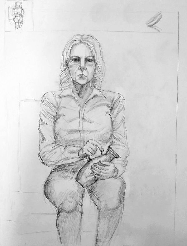
In today's session, we had to produce one portrait drawing while aiming for an anatomical accuracy of the figure and considering effective colour combinations. This composition as well as the previous one consists of clothing and its folds which could be a little difficult to overcome. Firstly, I drew smaller legs and arms. I don't know why but I have this tendency to make the limbs smaller than they are if I am drawing from life. I left some empty spots on the face in order to create a highlight caused by the lighting. in the studio.

I finished colouring it. Meantime, I was advised to have every colour of the t-shirt to the skin nearby. I inserted a slight tone of yellow cplpur to the arms and green to the face.

This is the final result. I smudged everything with a blender stump and then played around with some settings in Photoshop. Every time I was looking at this drawing I was seeing a barely visible contrast between values. The colours were too light, so I had to go through every part with an additional layer of the same colours. In addition, I darkened the eyes and the core shadows on the skin. Though, now as I am looking at it, I feel that I could have made the folds more obvious as they are missed in the pattern. Also the muscles have too simple lines which decrease plausibility.

Week 24- Classicism and Neoclassicism. Focus on Human Figure
This drawing session combined most of the skills we have learn so far. Now as I used so many medias for the first time, coming back to the traditional media - pencil it is like a gift.
However, this composition included folds which could complicate the task. I faced the issues where I was too overwhelming the shirt with too contrast creases.Therefore, I started increasing the darkness. for the bottom.


I darkened the bottom and the lightened the top because the difference between shirt and jeans was too subtle initially. Also, I worked more on the face. I erase bits that were too dark and lightly outlined the chin area.
In conclusion, I like how it turned out, especially the face and the hands. I feel that every time I draw human figures I have fewer and fewer questions about constructing them. Nonetheless, there are a few areas that I still need to brush up. These are, for example, the anatomy of muscles, hand structure and age features of a human body&face.
Week 23 -Muscle Structure. Combining Black and Colour Media
First and foremost start with the head. Now as I know this rule and it always makes the beginning easier. Also a useful tool you can use in order to check o your values and contrast are to see your drawing in black&white. It gives your eyes much obvious look on colours.


Also beforehand I tested two colour schemes for the drawing.

I adjusted shadows and inserted some new colours into the skin. As it turns out the orange colour is a perfect candidate for making the skin alive and creating a warm look.

Week 22 - Enhancement Week. Ink Wash in Traditional Chinese Painting
This week was an enhancement week. We had to choose either contextual or practical. I have decided to practice my drawing with ink. First of all I have chosen a picture of an landscape and very slightly sketched the main shapes.
After some useful feedback and a long gazing at the image, I strongly agreed to redo this task. Let me explain why. Firstly, in the foreground, you can see very straight grass without any lighting. Secondly, the background is too simple and there is no gradual transition that would create an illusion of depth. Also, I did not like the sky because I drew just some straight lines which did not look like clouds or anything else. One of the few things I liked was the tree's flow and movement towards the left. Although technically thinking, I could add more branches to it and play more with value variety.


I started with the focal point which was the tree.
I chose this picture as it also had a focal point, leading lines towards this focal point and gripping backgrounds.


The perspective did not match the reference's perspective as long as I have decided to focus on implementing values and convincing shapes instead of trying to perfectly copy the image I see. Also, I tried to play with the amount of water in order to create a range of different tones. I am pretty pleased with the contrast between the foreground and the backgrounds, however, I feel that the mountains on the backgrounds could have more details that would associate with some vegetation. Another thing I see improved from my first attempt is the addition of white and greyscale in the tonal variation.

At the end of the process, I used pen liner to create a nice wood pattern on the bridge and the house beams. Also, I touched on areas with overlapping and intersecting elements.
Anatomy studies
Due to our traditional art session when we were drawing nude figures I became inspired to study anatomy more. I decided to pick few references and draw for a whole week. I was interested in muscles and anatomy overall so I picked up some refs. Although it was quite a spontaneous decision to observe human anatomy, I still gained knowledge about muscle structure and line direction.


Week 21 - Human Body Dynamics. Using Indian Ink and Ink Washes
In today's session, we need to produce a timed series of sketches of a nude model in different poses with the use of ink. As it was my first time using ink in drawings, I was quite unconfident and unsure of how to use this technique. Other than that ink as a material turned pretty similar to watercolours. The important thing you have to keep in mind while drawing is if you take too much ink and less water you will have a bold line which will be very hard to blend. I faced that problem while drawing my first pose. Although I tried to implement this outline as shadows, it was still too visible. There are fewer black strokes on the legs which is much better than the top part of this sketch.

One of my biggest problems is simplifying the lines. When I draw bodies, I always start with simple shapes like cylinders and spheres. It is a good way to begin constructing the shape, although, when it comes to figure drawing and implementing more flow into it, I always struggle. Here I attempted to emphasize the muscles, convex and concave on one or another part of the body. When the drawing dried up, I touched the drawing with charcoal in places that I wanted to emphasize more. For example, the left leg and arm.

For the last drawing was advised to draw with only outlines in the areas of shadows. I just finished my pencil sketch and started outlining with ink. The time has gone and I did not have time to finish this piece until the end of the drawing session. Nonetheless, I got to like this material and I would like to practise this way of drawing more.

I've decided to redo two works that in my opinion did not turn out as I wanted at first. Now I wanted to convey the shadows and tonal values with less intensity and use the ink in a different way. I used more water and tried not no make harsh strokes. Afterwards, I touched the drawing with a charcoal pencil in areas that I want to emphasize.


Overall, I feel that my experience with ink is quite good as long as I have felt the freedom of this media. During the process. I have made a few mistakes which actually helped me to recognize my problems and eventually I quickly changed my workflow to what it has to be.
At first this pose was drawn pretty rough and with the bold outline of the figure. Now I was trying to be cautious with black ink and don't add much of darkness into highlits parts. Especcialy was hard not to create the outline as I wanted to establish the shapes as I used to. Usually I create the sketch for the body but here is another technique. You have to build it with the grayscale and tones.
Week 20 - Nude Figure on Black Paper
I have never used black paper along with chalk so it was an ėxсiting experiment for me. The important thing that I have learnt during this process is that you are drawing without shadows only with light. Analysing this drawing, It seems that the body is too simplified, though I tried to establish the muscles and diversify the curves.

I did not like how the farthest hand looked and was a whole mess. That is why I worked more on the fingers and made them more distinctive by erasing some parts. Also, I revised the contrast&brightness and tried to make the figure stand out in the black background.

Week 19 - Focus on Anatomy
I simply started with the head, and then measured the height with it. In the process, I was always comparing proportions to each other. For example, The head should be two heads in length. The legs should be 4 heads in length and equally divided where are the knees. The hands end in the middle of the thighs.


After quick linework, I shaded the full body. Although it turned out too excessive, so i will be erasing and redoing it later.
f


My drawing process with these two other poses was quite the same. However, the thing I noticed is that I have more confident in aligning proportions. Also, my biggest issue is drawing hands but I feel that after some practice I definitely improve my muscle memory on drawing hands.


I shaded these drawings as well. I wanted to point out muscles and maybe even exaggerate it as it is an anatomy study.
I have changed the shading technique a bit by making it more subtle. In addition, I tried to play with the line weight in order to emphasize the important parts of the figure. I made the closest and most interesting parts with thicker outlines and reduced the intensity of the line in the parts that are far away and have direct lighting


Week 18 - Impressionism and Post Impressionism. Portrait in Cold and Warm Colours
I was more confident drawing this piece as long as I was already introduced to the model's facial features. Though, one of the challenges is mixed colours. At first, I made a few mistakes. I started adding too many colours and it has become too dirty and messy. I erased some colours and considered using red, orange, vinous colours for warm colours and blue&purple for shadows. The second issue I came across was yellow next to blue. I did not realize and completely forgot that the combination of yellow and blue colours creates green colour, which is not what I wanted. As you can see in previous work (Week 17), I used the same colour combination, however, I managed not to overlap those two together. Therefore, I got rid of the yellow colour on the face and left it on the hair as the model has blonde hair.


In order to expand the colour range in this drawing, I tried to play with values and enhance already existing colours. I made the eyes darker, added an overall tone for skin, and darkened the cast shadows.

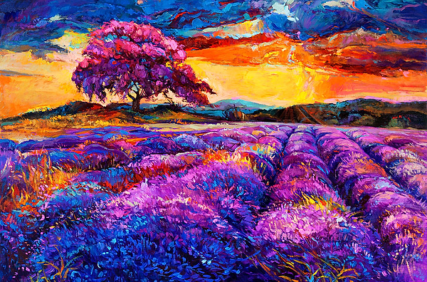
For this warm-colours drawing, I found a very good reference for the colour scheme. It is Lavender fields by Ivailo Nikolov. In his work, he used purple, red, orange, blue colours. However it is not a portrait, I can still pick up something from it. You can see how the artist roughly distributes the yellow colour on some lightest areas. The yellow colour causes an impression of sun rays penetrating the foliage. In my drawing, I used yellow colour for the lightest parts of the face as well.
In addition, I love this colour combination as it is always associated for me with a beautiful sunset/sunrise.
Lavender fields, Ivailo Nikolov
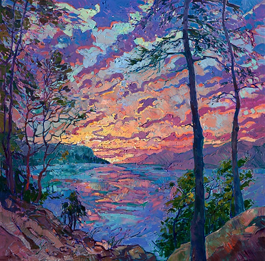
Here are other colour references that I chose to implement in my portrait.
Discovery, Erin Hanson

Dawning Vista, Erin Hanson
I smoothed the picture and made the difference between colours more intense by adjusting the values.

Week 17 - Composition in Portrait. Colour Aesthetics and Drawing Techniques
Today we drew warm and cold portraits. There is two way of completing such a task in terms of colours. Either you can go for warm tones and cold shadows or cold tones and warm shadows. I reckon first one, so I started sketching with burgundy colour and it ended up one of the main colours in this drawing. I believe this colour with a mix of blue colour for shadows creates a beautiful couple.


The other day I added more contrast by mixing dark blue&purple in shadows. Also, I adjusted the red colour on the skin, so it creates a value range - blue - dark red - orange - yellow - bright cream. To create a more smooth look, I smudged the colours with wet tissue and blender stump in some areas.

I started with eyes and it was easier than when I started with establishing head first. After, I drew vertical lines through the inner corners of the eyes. It shows me where supposedly the nose going to be.

For the cold drawing, I choose to draw Carol from The Walking Dead series. I am very impressed with her appearance and the lighting scenario is interesting and dramatic.

Now as I can compare these two images, I can say there are some issues, meaning facial proportions, that do not align with the photo. For instance, I have eyes on a higher level than it is. Here you can see that cheekbones are more distinctive than they are initially. The nose is a bit smaller and the lips should be slightly wider.

I could not figure out quickly what colours to stick with, thus I decided to look at professional works. I have been always very fascinated with the Van Gogh painting The starry night, therefore I attempted to integrate these colours into my work. The combination of blue and yellow colours creates such a huge contrast between values due to the fact that they are complementary colours.
The starry night, Van Gogh
I have made some changes to these two portraits. I've tried to distinguish some facial age features. It was very hard to do as long as I did not remember exact shapes, however by looking at some references of women 40-50 years old I could picture where are wrinkles and creases.


I cannot say that I like this work very much either, although I was experimenting with colour combinations a lot. At first, I used only blue and yellow colours. However, it did not create the colour of the skin and could likely fit an abstract painting rather than this allegedly realistic portrait. Therefore I have appended blue and pink colours that developed a pretty soft transition and allowed adding orange to the face. I almost completely got rid off the yellow colour and that helped to emphasize the realistic skin colour
Frankly speaking, this drawing now seems a bit overworked. Perhaps, it is the colour intensity but I tried to have a few different tones in the skin. Also, I got rid of this strange neckline which was pointing out and receiving unnecessary attention at first.
Week 16 - Renaissance and the Golden Dutch Age. Focus on Portrait
This week we have been working on portraits again, altought the material we were using is charcoal, which is quite a novel material for me. I started with quick thumbnails as always and established the position of the head in the canvas. I started with a vertical line that divides the head and then switched to the eyes. The person we were drawing has such a pronounces lower and upper eyelids which I picked up straight away. I struggled with proportions a bit as I could not establish how low the chin is. It is hard to say now if I am right or wrong with the facial proportions I drew as we could not take a picture of it and compare it out.


The thing I started loving about charcoal is the values and how easy you make any transition with them. It seems that it is much easier for me to start with the darkest values rather than with the middle-tone ones or even the brightest ones. The blender stump helps to smooth everything out as well and it gives it a more natural flow look. However, it still looks a bit dull in terms of black values. I need to invent some more grayscale values than it is now.

After a while, I have been working on this drawing. I've changed the shape of the face, so the chin is longer and the face looks overall higher. I have added the nasolabial cavities and adjusted the shadow underneath the nose. The shoulders looked a bit too close to the face, so I pulled them down. The values on the face were a bit off, therefore I've tried to work on that. I imagined this face as a sphere and tried to shade it that way. Using charcoal is still unusual for me, however, the thing I like this material for is that it blends very nicely along with the ability to erase parts you want to convert into highlights.
Week 15 - Human Head Construction. Part 3 – The Human Face
This week was the first week when we started drawing portraits from a real person. It seems that she turned younger than she was and I did not spot facial features that good to represent them here. I ended up finding lighting that goes from the left side, so the shadows lay on the right. Although, I could not produce as exactly the same face, Instead, I tried to embellish it as I want but stick to existed proportions and features.

I have made the features of the face more obvious and darkened the darkest parts which were the back of the hair, eyes, nostrils and drop shadow under the neck. In addition, I extended the jawline so it is bigger and more anatomically correct. In photoshop, I adjusted the brightness and contrast and darkened the corners of the face.

In the conclusion, next time I would definitely pick up more on some small facial features, like wrinkles. For now, it is an undiscovered area that will be very interesting to acknowledge and develop as a library of different human faces.